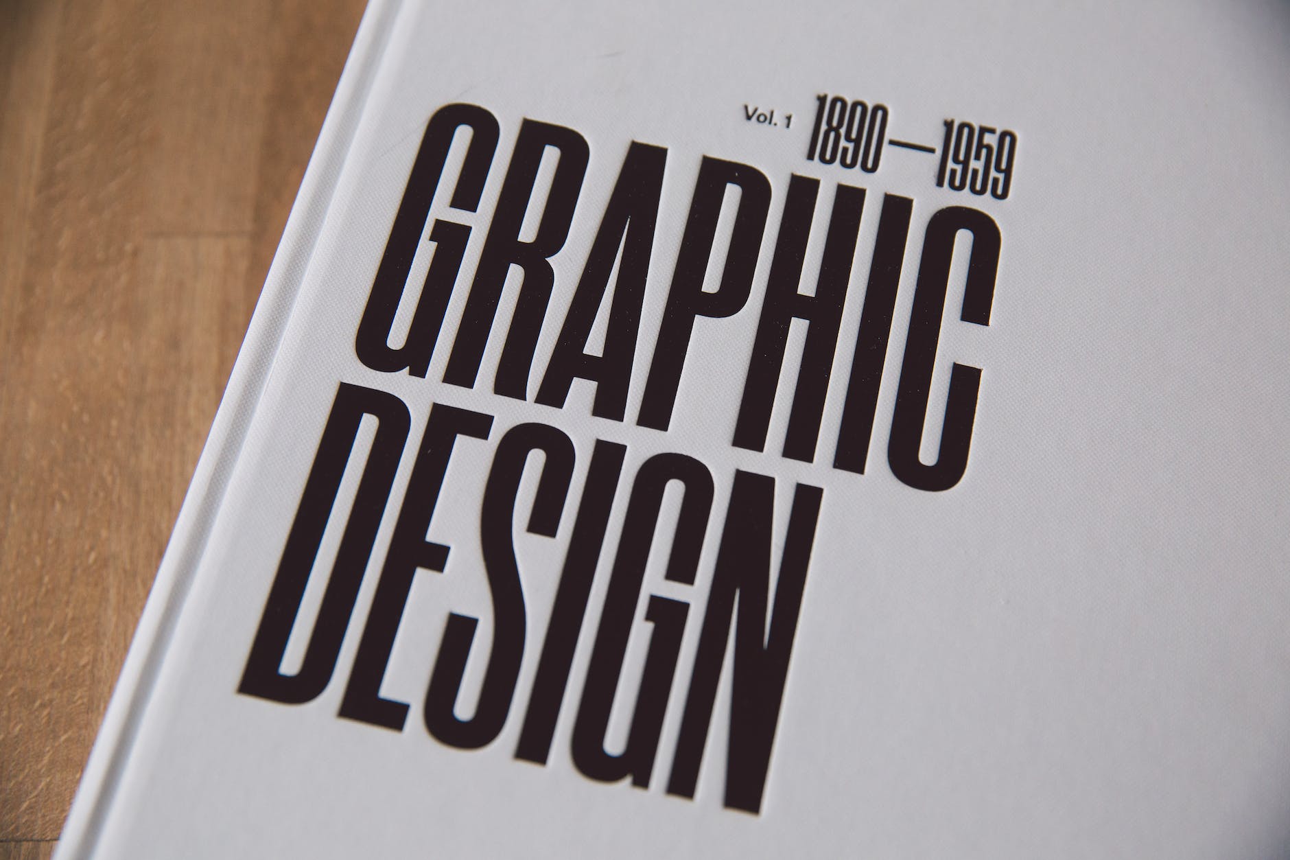
So you want to start learning graphic design, but have no idea where to start? No worries, we all started in your position, and this article is all you’re going to need to learn graphic design. First, we would like to welcome you to this exciting field and wish you success in your journey of becoming a successful graphic designer.
I) Graphic Design Software
Now before we start, you need to choose the right graphic design software for you. This is going to be a guide where we look at the top graphic design tools to get you started.
- Adobe software: As designers, it’s extremely hard for us to recommend anything rather than Adobe applications for professional design, the big 3 or as we like to call them: “the holy trinity” Adobe Photoshop, Adobe Illustrator, and Adobe InDesign are considered the industry standard for designers across a lot of different disciplines, so for collaborative work and the desire to stand out it is almost a must to get them. Its uses are not only limited to graphics editing alone but digital art as a whole. The whole Adobe Creative Cloud would cost you around US$52.99/mo, but you can lower that cost if you’re a student or teacher and save over 60% of the cost. Another alternative would be to only pay for the apps you want. If you don’t have the budget then no worries, we have other apps for a fraction of the price and even free!
Get your Adobe Creative Cloud here. - Affinity software: Just like Adobe software, Affinity has good tools for graphic designers that you could take advantage of as a beginner. Affinity Designer, Affinity Photo, and Affinity Publisher are great alternatives to the Adobe apps, they offer a wide variety of tools that help with vector and raster graphics. The Affinity team is working very hard and quickly making it the number one choice for many designers, especially with how smooth the apps run. Now unlike Adobe’s monthly subscription, Affinity has a one-time payment only.
- Gimp: What many new graphic designers need to know is that Gimp is not trying to be Photoshop, their team had come up with their own workflow, and the tools and presets were all set up for that workflow. If you can tolerate not having CMYK and the integrated SVG editing Photoshop has, then Gimp is a powerful editing tool for graphic designers to start learning and not worry about the cost. Unlike the previous versions Gimp a completely free raster graphics editor that you can use for image manipulation and image editing, free-form drawing, and many other tasks.
Stay tuned as we will dive deeper into graphic design software in an upcoming post.
II) Typography in Graphic Design

Typography is basically the art of written communication, text occupies a huge percentage of most websites and print media and it could either make or break your design. A great design teacher once said something along the lines of: “If you can’t illustrate, then you want to be great at typography”.
IF I WritE likE this, iM SURE iT Will IT DRIvE you Crazy !?
The goal of a graphic designer is to transfer a message and visual feelings to the consumer. And depending on that message you want to convey, you need to alter your approach to your typography.
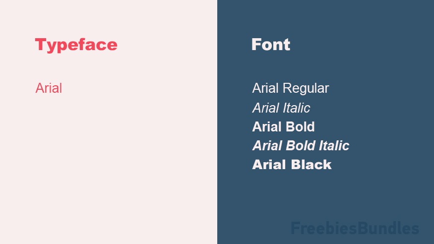
1) Typeface vs. font
First of all, you need to understand the difference between a font and a typeface, a font is a specific weight, width, and styles that constitute a typeface family, while a typeface is a collective name of a family of related fonts. Not all typefaces consist of multiple fonts, however. For example, Arial is a famous typeface that everyone has on their computer, but Arial Bold is a specific font within the Arial typeface family.
2) Type Classification
Type classification is the system used to divide typefaces into categories. Most typefaces fall into four broad categories: serif, sans serif, decorative, and script. Knowing the difference helps you as a graphic designer to distinguish them visually, choose the right one for your design, and to assist in combining them. Always keep this quote in mind when choosing your typeface: “The best font choices are the ones where readers do not notice the font but the message”
- Serif Typefaces:
A Serif is a small line, structural detail, or flourish at the extremities of a type character. Therefore a Serif font has “feet” or added extensions like the top and bottom of the Times New Roman serif font for example.
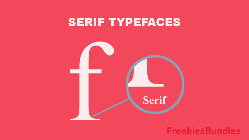
Serifs invite you to sit by a roaring fire and hear a long story, they are mostly used in printed books, magazines, and newspapers because they are more readable on printed text, thanks to the serif at the bottom of the letter provides a line on which you can read the text.
- Sans Serif Typefaces :
The word “sans” comes from the French vocabulary and means “without”, meaning sans-serif is a typeface without serifs or “feet”. A good example of a sans-serif font would be Arial.
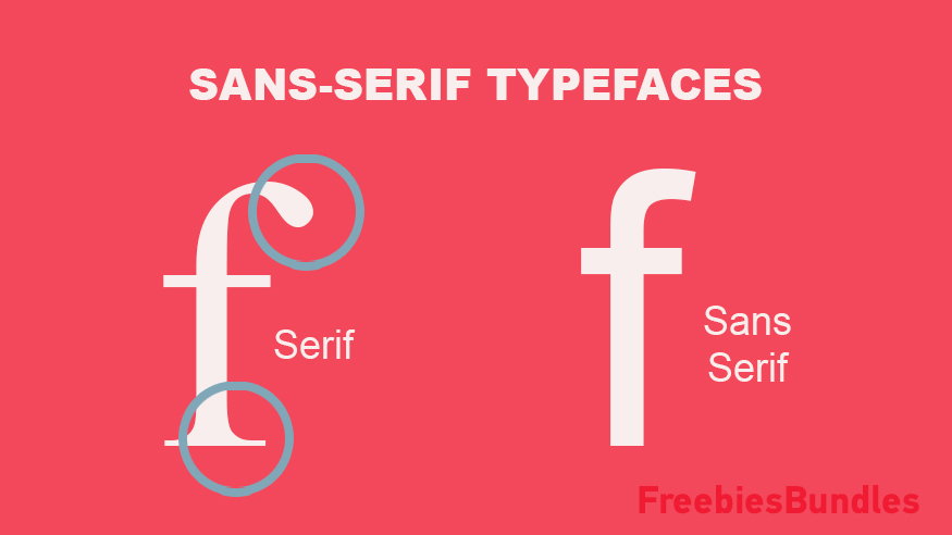
Sans-serif works better in screens and digital devices when used in small sizes because unlike serif fonts, they don’t lose detail and shape when you use them on a screen with low pixel density. The empty space left by the lack of serifs makes for better readability. These typefaces are also more modern, bold, and tend to make good choices for large headlines.
- Decorative Types:
As the name suggests, decorative types have ornaments and decoration elements. Decorative typography is a large category that includes many style variations. Burbank Big Condensed in the example below is a good decorative font.
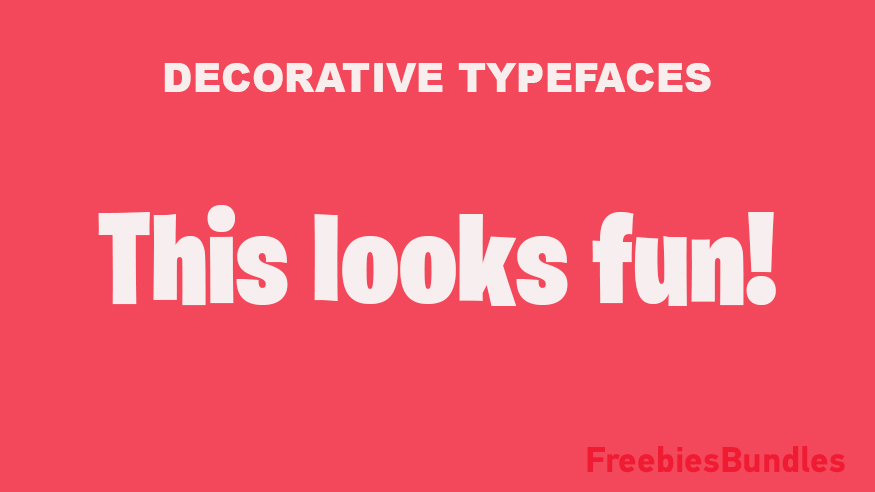
It is very easy for these types to fall out of fashion and get outdated if their design is too topical or niche, so it is important to approach them with precaution. They are best used for logos and word-marks, a good use for decorative fonts in graphic design is the “Ben & Jerry’s Ice Cream” logo.
- Script / Cursive types:
In a nutshell, script or cursive types are types that mirror cursed handwriting, they have a personal touch like calligraphy and handwriting fonts. The only difference between them is that script letters are connected to each other within each word; while cursive letters are not connected. Love Letters Regular bellow is a good example for script fonts.

In graphic design, they are mostly used for invitations, scrolls, and situations where elegant typography is called for. They are not suitable for large bulks of text but can look really beautiful in large sizes when used in headings and in logos.
3) Kerning
Kerning originally comes from the word “kern”, it refers to a notch or mortise that was cut into the back of a piece of metal or wood type, allowing a letter face to overlap an adjoining letter. It was a way of solving the problem of awkward letter spacing. In typography it means basically the amount of space between two characters or letters, as a graphic designer; your job is to adjust that space to create a visually pleasing result.
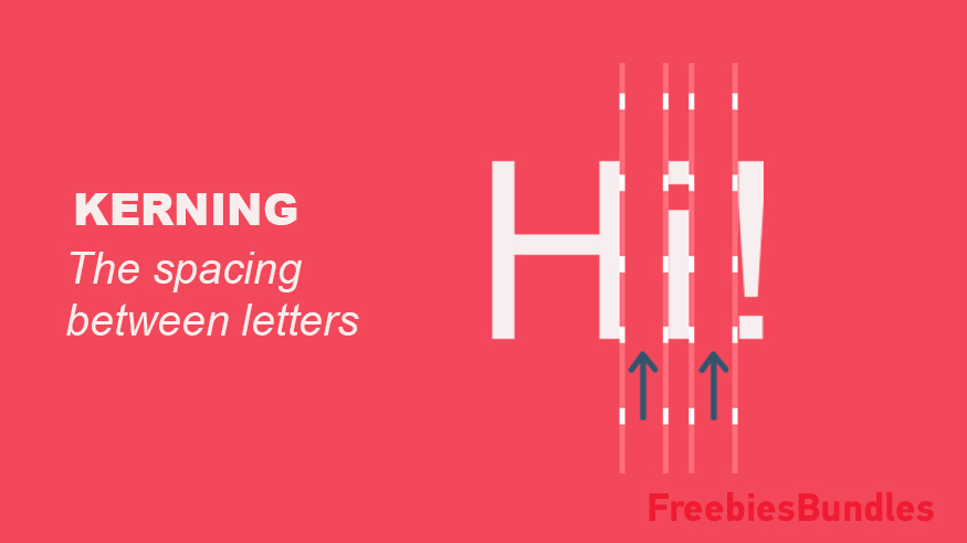
This is a hard concept to grasp as the human brain usually cannot easily process comparisons between more than two items at the same time. You don’t have to worry about it because with a little practice you will understand the basics and move from there.
4) Leading
Leading is similar to kerning, but instead of the horizontal space between characters, leading focuses on the vertical space between baselines.
The tighter the spacing between the lines, the harder you make to read. The same applies to the spacing that is too large between baselines. You have to practice finding the balance and correct spacing to take your graphic design skills to the next level.

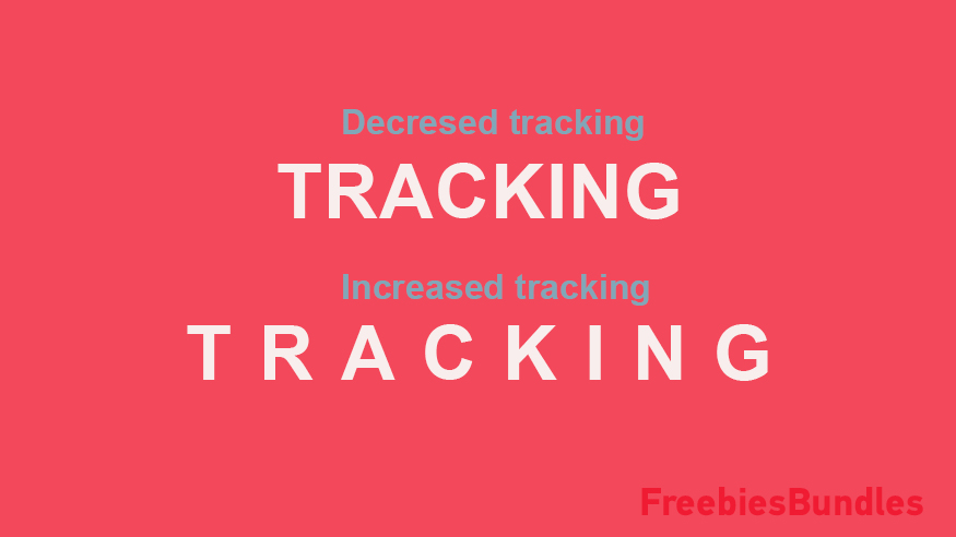
5) Tracking
Also similar to kerning, tracking is an adjustment done to the spacing between letters or characters. Instead of focusing on the space between a pair of letters, tracking means adjusting the spacing between all the glyphs (letters, numerals, punctuation, etc.) in a piece of text. This can help to make a page full of text look a little more readable and inviting. This example will help you better understand this concept.
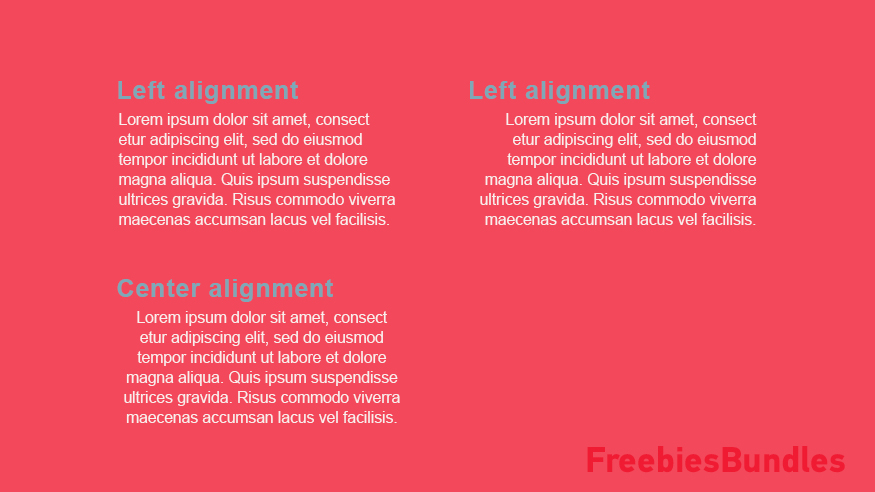
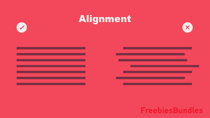
6)Alignment
Alignment is the process of lining up text paragraphs you can choose from left align, right align, center align, and justified. Humans are much more used to left-aligned text, so it is recommended to use it especially for your paragraphs. Center-aligned can also work in cases where you deal with headlines or small amounts of text, while the right-aligned text is rarely a good idea.
Here are some good books we suggest to help you with your typography:
Modern Typography
Dangerous Curves
Type Matters!
Typographie: A Manual of Design
Type Primer, A
III) Layout and Grids in Graphic Design
In graphic design, and particularly typography, grids and layouts are an effective tool that assists you in laying out a page. They help achieve a structured and organized page layout by maintaining consistent column widths, margins, gutters, images, etc. Many graphic designers argue that as a beginner designer, you don’t need to learn layouts and grids. While this is true to a certain extent, we STRONGLY suggest you consider the grid as your friend, this will make your design process much more easier and professional.
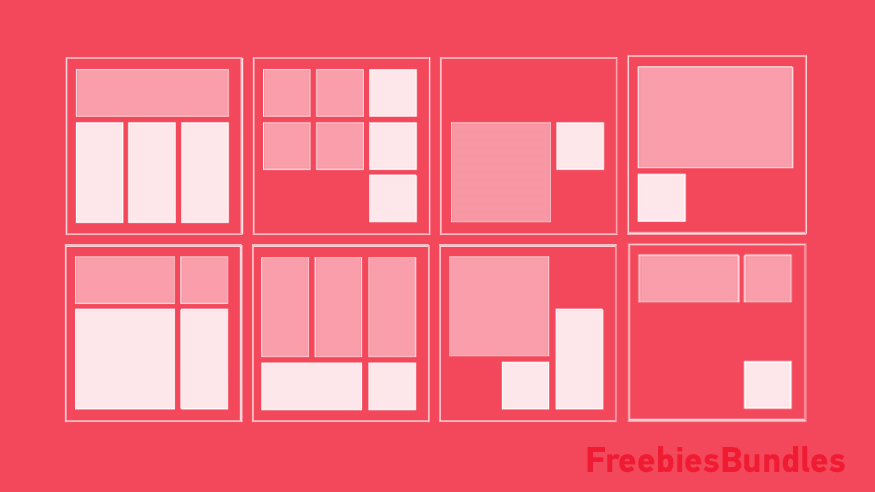
A good exercise to get the hang of layouts and grids in graphic design is to start a document with a drawing of the golden ratio, then dividing up the modules into halves, thirds or fifths. Then further dividing those modules into halves or thirds if desired. This usually results in some very interesting layouts. We suggest you start collecting layouts (from Swiss design for example) and see if you can figure out the grid system they used on your own, then saving it as a template for your future designs. With a little practice, you will get the basics of this very important skill.
We 100% recommend Grid Systems in Graphic Design by Josef Mülller-Brockmann. https://amzn.to/3cahfcX , It is considered as the bible of grids, real eye opener for graphic designers. One quick tip: don’t get tripped up by the insane grids in this book! Start simple and give yourself years to work up towards the wilder grids.
IV) Visual Hierarchy in Graphic Design
According to Gestalt psychology, visual hierarchy is a theory of perception that explains the visual perception of elements and how people tend to unify the visual elements into groups. As a beginner, you need to understand that basically, visual hierarchy is the principle of arranging elements to show their order of importance, so that users can understand the information easily. You strategically place the elements “Pictures, text, icons…” in order to influence users’ perceptions and guide them to desired actions.
“Chaos was the law of nature and order was the dream of man”.
– Henry Adams
Here are the basics that you need to understand to create a Visual Hierarchy:
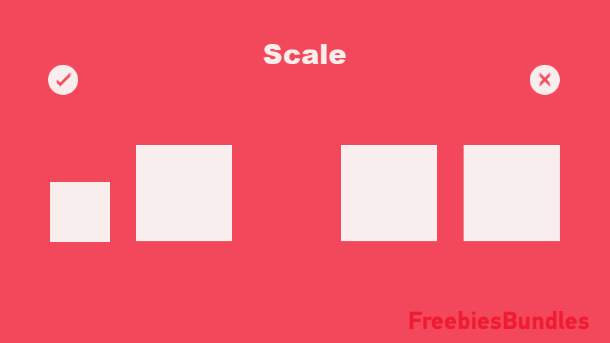
1) Size and weight
Users notice elements that are larger in size more easily. Elements with bigger sizes and scales get visual precedence over others.
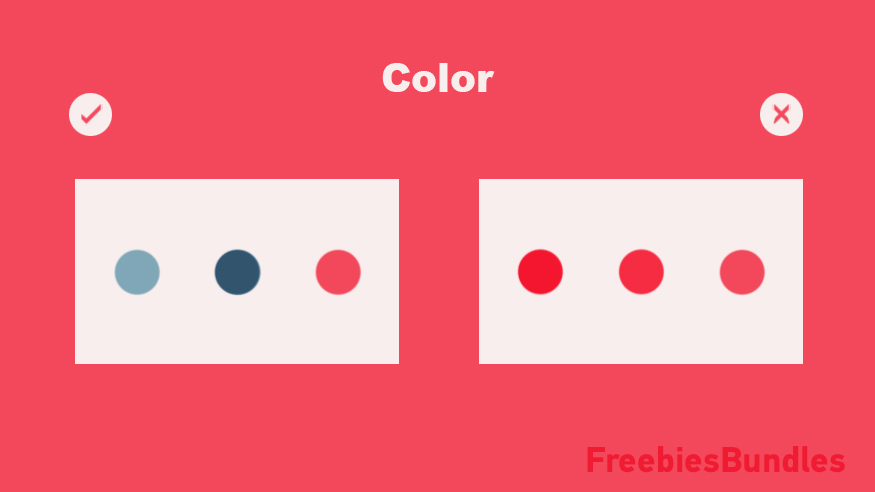
2) Color and Contrast
There is a large array of emotional responses that are associated with colors, and by nature, humans are more drawn into bright pop colors as compared to muted tones. Keep this in mind by using brighter tones, richer and darker hues to attract attention while using lighter tints or grayscale colors for elements with less importance.
Contrast is the difference between elements in a composition, the bigger the difference between the elements, the greater they are easy to compare and comprehend. Contrasted colors grab more attention than less contrasted ones. For example, black contrasts well with bright colors, you can try to combine it with red or orange in your future designs.
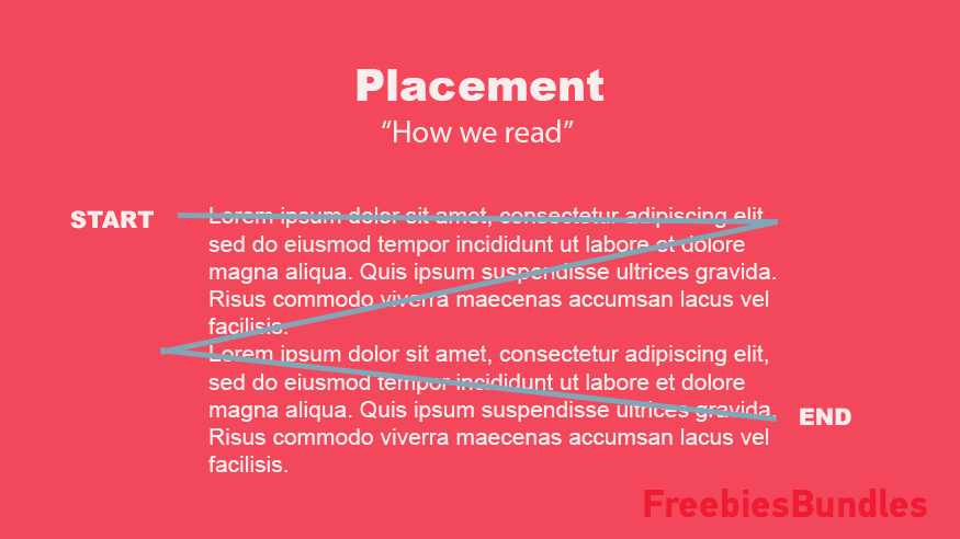
3) Placement
Good graphic designers know how to use good positioning to draw the user’s attention to specific points, the same way photographers and cinematographers use placement and framing to evoke different emotions and perceptions about their subjects.
In web pages, for example, certain areas receive more attention than others. The user’s eyes fixate on the most on the areas along the top and left sides. Thus, these areas can be used to display more important content.
4) Whitespace
Whitespace refers to the empty area around the content, it may be white or any other color. More space around a certain element naturally draws the eye towards it.
5) Alignment
Correctly aligning text or other elements, helps to create order, organize your elements, create visual connections, and improve the readability of your design. By default, large and out-of-alignment elements stand out over aligned ones.
6) Texture
The texture is a characteristic component of graphic design that is represented by visual elements like patterns, colors, illustrations… It gives the sense of feeling, touching, and actualization. Like every other element in this list, a richer, more texturized element stands out over flatter ones.

7) Repetition
Repetition is simply repeating a single element many times in a design, repeated elements with the same style can suggest content is related.

We hope you find this blog post about how to start learning graphic design useful and help you to create better graphic design projects and learn how to focus the most important elements from your design.
If you liked this article, you will be interested in these other articles about graphic design fundamentals and other useful graphic design topics.
